
patreon
app REDESIGN // mobile // ios (HIG)
// CLIENT //
Patreon
**this is an on-spec project
// SCOPE //
4 person team, 2 week sprint
// MY ROLE //
Project Manager, UX research, UX design, UX writing, UI design
// TOOLS //
Sketch, InVision, Trello, Whimsical, Google Drive
the business
In 2013, YouTube musician Jack Conte was looking for a solution to his problem: millions of people loved his videos, but only hundreds of dollars were hitting his bank account. This didn’t add up, so he drafted up an idea and brought it to his college roommate Sam Yam, now co-founder of Patreon. Now it’s 2019, and Patreon is the solution to this same problem for over 100k creators with more than 3,000,000 patrons supporting creators each month.
Patreon allows content creators to set up tiered incentive plans for fans to receive special gifts and rewards in exchange for monthly price tiers.
the challenge
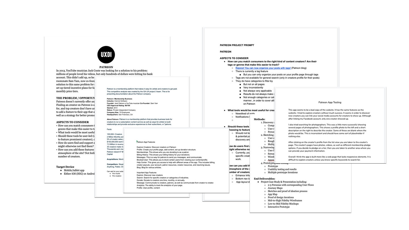
Patreon doesn’t currently offer any form of marketing or promotion to its creators. Finding a creator on Patreon is almost impossible if you don’t know who you’re looking for, and top creators don’t have any way of promoting their success.
Patreon would like to add a feature to their app that allows creators to market and promote their work, as well as a strategy for better promoting their creators to the right people.
the goals & outcomes
Though my teammates and I were initially just tasked with the creation of a discover page, that was not the only end result. Through the design process, I was able to see that there were much more opportunity within the app redesign that would benefit the users equally, if not more so, than adding a discover page.
Create a discover page for Patreon users
Create a strategy for better promoting creators to the right people
Completely redo the information architecture of the app
Drastically enhance search feature of the Patreon app
Better utilization of icons and UX copywritting to create ease of use
Give users ability to browse and use the app without having to sign in (until they decide to donate)
Provide Patreon creators better visibility into their profile data and stats
quick glance at the main screen before & after
// before //
// after //


app redesign clickable prototype
my approach
Through both qualitative and quantitative research methods, I was able to empathize with the existing and potential Patreon users to understand their needs and priorities when using the app. I also made sure to experience the app for myself and always kept in mind the goals of the users as well as the business.
Methods // online reviews & research, user interviews, competitive analysis, contextual inquiry, app map, affinity mapping, card sorting, personas, journey mapping, user flows, sketching, wireframes, prototype, prototype testing and iterating
25 interviews with current and potential users
3 journey maps, journey flows and personas
4 contextual inquiries
2 rounds of testing and iterating on prototype

research key insights
An important early distinction I found with Patreon is that there are in fact 2 separate groups of users:
Creators// Artists who use the platform for income
Patrons// People who use the platform to support creators and obtain exclusive content
// business analysis, online reviews & research //
Creators who do not have strong social media presence outside of Patreon have a much harder time with discoverability
The current platform hosts a huge list of different features and integrations, but knowing which to use and how is difficult for users
The current app has an extremely limited and frustrating search function
The app seems to be a bad copy of the website
The app is built more a web page and lacks responsive elements
Patreon is still one of the top platforms in the market
Majority Patreon’s competitors have better information architecture and usability, but less active and recurring users
// USER interviews //
A large number of the creators we interviewed really dig Patreon as a platform, and believe in what the company is trying to do
The lack of discoverability kept coming up, especially for the lesser know creators
Another recurring complaint was the apps overall usability

what does this mean for Patreon?
Patreon was the first app of it’s kind in the market. When Patreon launched, artists/creators were so happy to see that finally someone saw their problem and cared enough to create an app just for them.
However, since Patreon’s launch in 2013 several competitors have joined the market, and as creators continued to use the platform and rely on Patreon’s membership subscription based model as a means to increase revenue, they started to find holes in the platform.
So, like any young aspiring tech company, Patreon was eager to hear feedback and try to constantly do their best to be active listeners of their audience.
Patreon heard their users. And their passion to alleviate the pain points brought to the company’s attention led them to want to try and solve all of these things. Their execution, however, was not so great…
Patreon, it seems, wanted to do their best to improve based on user feedback, that they ended up catching a major case of featuritis. At the end of the day, Patreon rolled out updates and solutions to help the creators and patrons. But none of their enhancements actually improved the overall functionality of their app or fixed any pain point entirely.
In this case, the more integrations and enhancements resulted in less visibility and information architecture.
Though all of these modifications over the years, the one thing Patreon did not really even attempt to do, is tend to the users’ needs of discoverability. And with a lack of information architecture, even something as simple as searching for a specific musician or artist is a cumbersome and confusing process for the users.

// how in the heck do you solve for all of this? //
Discoverability // The app redesign enhances discoverability through a new browsable discover page, which is the page that you automatically land on when the app opens. The discover page has categories and filters.
Information Architecture // The other main concentration of the redesign was to completely rebuild the information architecture of the app. Some of the major information architecture changes include creating a bottom nav bar for this iOS app, making the search a main selection of the nav bar, creating easy ways for creators to view their notifications, profile analytics page, messages, and any other integrations that they see as helpful features of Patreon.
We need to bring all the features to a place where creators and patrons actually know they exist, and in turn, begin to enjoy using the app and continue (or start) utilizing the Patreon app on a frequent and consistent basis.
revolving the redesign around the people of patreon

The Optimistic Creator
“I believe in Patreon’s ethos and passion. They are sincerely doing their best to help the creative class get paid.”
// needs & goals //
The Optimistic Creator has a solid social network of fans from years of playing music but needs a platform to monetize their music in order to live sustainably off their passion.

The Introverted Illustrator
“Nothing I’ve tried results in a spike of new patronage. I’d like to know how many visits my posts get and the sources. Otherwise, how will I know what works?”
// needs & goals //
As a Patreon Creator, they need a better way to understand their followers through data. The Introverted Illustrator is not very well connected on social media, so a better platform for discovery on Patreon will make it more likely for fans to find their work. Easy access to data on patrons will help them know how to best appeal to their growing audience.

The Tentative Subscriber
“I’d love to hear more from podcasters that are creating innovative content, but it’s hard to justify paying for it when there is so much material out there that can be had for free.”
// needs & goals //
The Tentative Subscriber needs to have access to a wide range of compelling podcast material to feed their appetite for knowledge and information. They are an empathetic and compassionate, but they’re still off put by subscription-based content and “pay walls.” The Tentative Subscriber isn’t totally opposed to the idea, but if they is going commit to a paid subscription, it needs to be for someone or something that stands out, and the process of subscribing needs to be seamless and hassle-free.
bringing the needs & goals together
// solving for the people of patreon //
The redesign of the Patreon mobile app allows creators to pursue their passion while generating a reliable revenue stream on a subscription based membership. Patreon provides easy access to page analytics and data for creators, and helps promote discoverability. The Patreon app gives patrons exclusive access to creator’s content based on their subscription tiers and helps users discover other creators they will enjoy.

key takeaways
I was originally tasked with designing an internal marketing strategy for creators. However, based on user testing and interviews with actual creators and patrons, a redesign of the current app for improved discoverability made more sense as a priority for the platform. It would solve one of the biggest issues with the current app, and help patrons and creators alike.
Through multiple iterations I was able to arrive at a foundation for an app with a familiar and intuitive interface for discoverability.
next steps
Go back to discovery and research phase to dig deeper into our findings from the first round of interviews and research
Test latest iterations with current Patreon users
Spend more time on usability and app information architecture
The focus on exploration could be further improved through curating more personalized discovery content.
// see all my patreon work //
RESEARCH & SYNTHESIS // Google Drive Folder
WIREFRAMES // Sketch File
CLICKABLE PROTOTYPE // InVision
